There is no research-backed magic number of finish options to show a client. The famous jam study found that a 6-option display sold far better than a 24-option one, but a meta-analysis of 50 experiments later put the average effect of more options at about zero. What the research does point to is the conditions that make large sets hard: options that are complex, decisions that are hard to compare, and clients who don’t yet know what they like. In practice, that means curating a short set for each decision, splitting compound decisions into single ones, letting the client compare up to three options side by side with the price on each, and recording what they approve.
What the choice-overload research found
The jam study. In 2000, Sheena Iyengar and Mark Lepper set up a tasting display in an upscale grocery store that offered either 6 or 24 jams. The larger display drew more people: 60% of passers-by stopped, against 40% for the small one. But nearly 30% of shoppers at the 6-jam display bought a jar, and only 3% at the 24-jam display did. Two more studies in the same paper, on essay topics and chocolates, pointed the same way, and participants given fewer chocolates to choose from reported more satisfaction with what they chose.
The meta-analysis that pushed back. In 2010, Benjamin Scheibehenne, Rainer Greifeneder and Peter Todd pooled 50 experiments with 5,036 participants. The mean effect size was d = 0.02, which they called “virtually zero,” and the results varied widely between studies. They found no conditions that reliably produce overload. They did identify two preconditions that make it more likely: choosers who lack familiarity with or prior preferences for the options, and the absence of a clearly dominant option. Expertise and prior preferences pushed results toward more choice being better. The authors also noted that a German supermarket replication of the jam study found no negative effect.
The meta-analysis that found moderators. In 2015, Alexander Chernev, Ulf Böckenholt and Joseph Goodman analyzed 99 observations (N = 7,202). They found that once four factors are accounted for, assortment size does have a significant effect: choice set complexity, decision task difficulty, preference uncertainty and a decision goal focused on minimizing effort. Higher levels of each made overload more likely.
So the evidence is mixed. A large set isn’t harmful in itself, but the conditions that make it harmful are common in a remodel. The client rarely has firm preferences about countertop materials, the options differ on several attributes at once, and the decision feels high-stakes and hard to undo.
Curate a short set for each decision
The research gives no fixed count, so set yours by how different the options are and how sure the client is. In the kitchen remodel Coffered was built around, the sizes ran like this:
- Flooring: 3 options, labeled A, B and C, each a specific plank product.
- Countertop: 7 options, two specific Cosentino surfaces (one Dekton, one Silestone) plus five generic looks (white quartz, two marble looks, black granite, butcher block).
- Backsplash: 8 options, four specific tiles plus four generic looks, including a slab that matches the counter.
- Cabinet color: the largest board, with stained walnut-tone lines from several cabinet makers and a set of painted colors.
- Wall paint: 5 colors, including one matched from a can the client already owned.
- Island pendants: 4 template styles (globe, dome, drum, lantern).
The larger boards worked because the client could narrow them. Every card had a Remove action that moved it to a Removed list instead of deleting it, so cutting an option was low-risk. Removing what you know you don’t want is how a client builds the preferences that, according to both meta-analyses, make larger sets easier.
Split compound decisions into single ones
Complexity, one of the 2015 moderators, rises when each option bundles several attributes. A “cabinet package” that combines door style, color, island color and hardware is four decisions disguised as one. The remodel kept them separate:
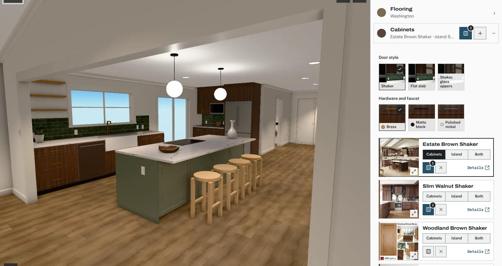
- Door style: Shaker, flat slab, or Shaker with glass uppers.
- Perimeter cabinet color and island color as two choices, with an option for the island to match.
- Hardware and faucet: brass, matte black, or polished nickel.
- Countertop material and counter edge (eased, full bullnose, or mitered) as two choices.
- Backsplash tile, tile layout (offset or 45° herringbone), and tile height (standard 18” or full height around the window) as three choices.
Each of those choices has 2 to 3 answers, which is easy to hold in mind. The large sets were the material boards, where the client was reacting to a look, not juggling specs.
Compare up to three side by side
Comparing options from memory makes the task harder, and task difficulty is another of the 2015 moderators. In the remodel’s design center, each card has a Compare toggle; the comparison opens once two are ticked and stops at three, and it shows the chosen options’ specs side by side. Three is a design choice, not a research finding. It’s enough for a final round between close candidates and small enough to fit on a phone screen without scrolling sideways.
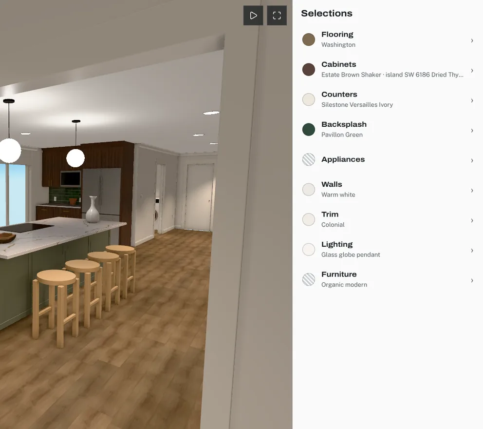
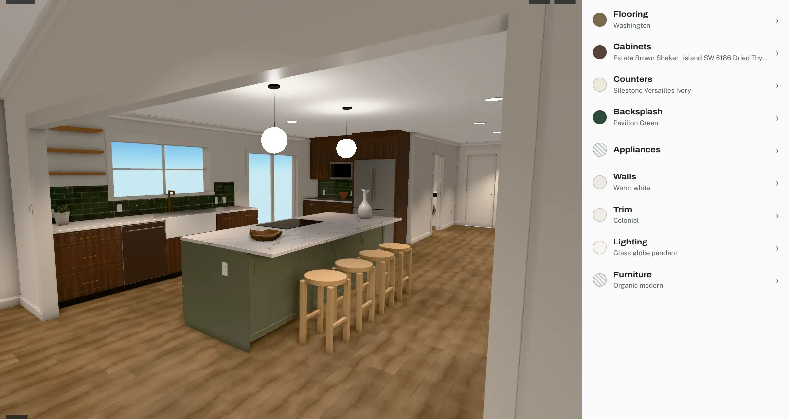
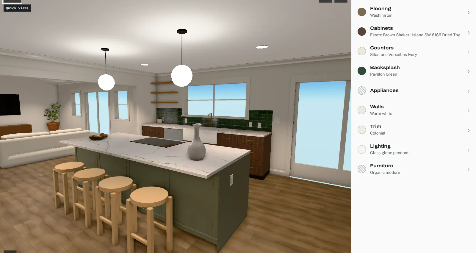
Comparison is stronger in context. The remodel’s 3D room let the client switch a finish and see it on the floor, cabinets or counter, and Quick Views jumped the camera to set positions: the living room, the island, the dry bar, the back of the house, the play room, the bedroom, the laundry and a top view. Seeing the same view with option A and then option B is a more direct comparison than looking at two swatches.
Show the price with every option
A finish choice is also a budget choice, and a client who learns the price after falling for an option has to make the decision twice. Put the client price on each card and keep a running total for the whole selection, so the effect of each change is visible as it’s made. In the remodel, prices followed the way each item is bought: countertops and backsplash by the square foot, cabinets by the linear foot, lights by the fixture, and flooring by the box with a waste allowance. Layout choices that add cost said so; the full-height backsplash, for example, added tile around the window up to the ceiling.
Price is also the simplest way to create a dominant option, which the 2010 meta-analysis found makes overload less likely. If two countertops look nearly the same to the client and one costs less, the decision often makes itself.
Record the decision
The final step is a clear record. A decision that lives only in a text thread gets reopened. Publish the selection as a version, have the client approve that version, and keep the approval with its date. Treat later changes the way plan sets treat revisions. In the remodel, there were two plan revisions a week apart, and the later set marked three sheets of the earlier one as superseded, so nobody had to guess which drawing was current. Finish selections deserve the same clarity: one approved version, with earlier ones kept but clearly marked as replaced.
How Coffered handles this
Coffered’s client design center was modeled on that remodel. The client switches finishes in the 3D room, compares up to three options side by side, sees each option’s client price and a running total, comments, and approves a published version. Trade prices, markup and suppliers stay on the studio side.
Sources
- Iyengar, S. S., and Lepper, M. R. (2000). When Choice Is Demotivating: Can One Desire Too Much of a Good Thing? Journal of Personality and Social Psychology
- Scheibehenne, B., Greifeneder, R., and Todd, P. M. (2010). Can There Ever Be Too Many Options? A Meta-Analytic Review of Choice Overload. Journal of Consumer Research
- Chernev, A., Böckenholt, U., and Goodman, J. (2015). Choice Overload: A Conceptual Review and Meta-Analysis. Journal of Consumer Psychology (Kellogg School of Management summary)