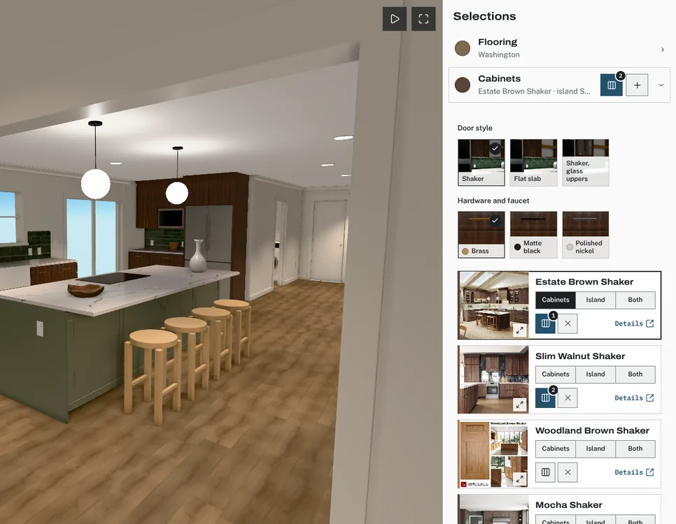
What it is
Compare lets your client tick up to three options in one category and open them side by side: the photos, the specs that matter for that category and the client price of each. In the kitchen remodel, the cabinet category alone held more finishes than anyone could weigh at once, so the comparison was limited to three.
The problem it solves
A long list of options is easy to browse and hard to decide from. Putting a short list next to each other, with the same specs in the same rows and a price on each, turns browsing into a decision.
How it works
Tick
Each option card has a Compare tick on its photo. One tap adds it; a second tap removes it. The category shows how many are ticked.
Open
The comparison opens the ticked options in columns, with the same specs in the same order for each.
Try in the room
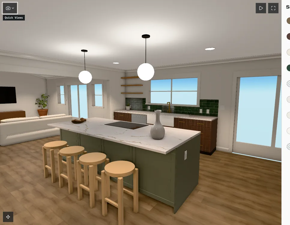
Any compared option can be picked straight away, so your client sees it in the 3D room before deciding.
Narrow the list
Options your client rules out can be removed from their view and restored later; your library keeps them.
What your client sees
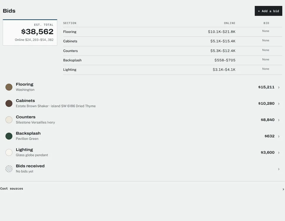
- Photos, specs and the client price for each compared option.
- The running total change as they pick.
- Options you add from a product or Pinterest link, alongside the ones from your library.
What stays private
Trade prices, markup and suppliers never appear in a comparison. They live in a studio-only table that no client view reads.